Woven Words
Coordinating Colors and Patterns in Carpeting
When carpeting your home, office, or other space, using the same color throughout can look uninspiring. At the same time, it shouldn’t look like a hodgepodge of floor colors. You can maintain a look of sophistication and flair by coordinating colors and patterns when you use quality carpet in a space.
How Can You Coordinate Colors and Patterns in Carpet?
Ultimately, the exact style of your carpet depends on your personal preference as well as the purpose of your carpeting. However, it is helpful to consult a guide when making design decisions. Consider the following factors when coordinating colors and patterns in carpeting.
1. Neutrals
Using neutral colors for carpeting works well and goes with many types of design styles. For example, choose a light shade such as a sandy hue for the carpeting in the majority of your home or space. Then, consider using darker natural-colored carpeting in a sunken or adjacent living room or formal living area that coordinates with the lighter hue. You may also do this with light and medium gray. Use the lighter color for the majority of your carpeting. Then, select darker shades to highlight different areas in your home, such as an entertainment space or a library or even your home office. However, the reverse is also possible. It just depends on what you like best.
2. Nature-Inspired
Using various shades of a color found in nature such as brown, green, or blue will also work well for carpeting. For example, you can select a dark, grayish-green for your hallways where the foot traffic is highest. The darker color will help to hide any dirt. Then, opt for a lighter green color for each of your bedrooms. A mint green will look fabulous in your living areas and keep the decor looking bright and feeling open. Blue suede and deep-sea blue are also great shades to use in your home and look quite elegant with both traditional and contemporary decor styles.
3. Coordinating Patterns
Choosing to mix a pattern with a solid in a similar colorway is another way to create a wow factor with carpeting. A fabulous way to do this is alternating the two with a border. It works with either the solid or the pattern as the border. Choose a geometric pattern for a transitional look or a floral design for a more traditional appearance. This look works well in a hallway, a formal dining room, living room, or a master bedroom to give your space a distinctive flair that everyone will love.
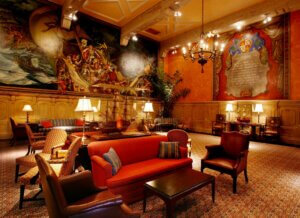
In a hospitality space, for example, you could also create a stripe pattern with alternating colors. This could be a striking look in carpeting for a large event space, lobby, or entranceway.
When deciding how to carpet a room, create a unique high-end look by using multiple shades of one gorgeous color. Using only two or three shades works best to maintain a luxurious look.
How Can Bloomsburg Carpet Help?
At Bloomsburg, we are passionate about high-quality, beautiful carpet designs. For more information about installing carpet in alternating patterns and colors, please contact our design department at Bloomsburg Carpet today. Likewise, if you have any further questions regarding our variety of styles, do not hesitate to call us.
Related Articles
Walking On Opulence: Exploring The Best Luxury Carpets
Luxurious carpets are essential to interior design because they take rooms to new levels of comfort and luxury. They’re still…
Read More 🡒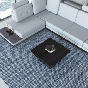
Step Into Comfort: Unrolling The Luxury Of Silver Creek Carpets
Silver Creek Carpets by Bloomsburg Carpets has revolutionized interior design, offering high-quality carpets that elevate any interior space. Constructed with…
Read More 🡒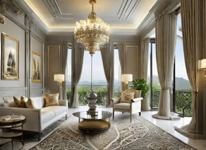
Discovering Opulence: The Most Beautiful Rooms In the World
Creating a space that speaks to your sense of style and comfort is not an easy feat. It takes time,…
Read More 🡒